Rugby Wine Logo Project
I was tasked with designing a logo for the CEO at the current company I work at for his wine vineyard. He wanted it to be inspired by Rugby School in Rugby as well as have a modern finish.
RESEARCH
Research is always a must and so I was looking for ideas and inspiration to help me get started. I then knew since this brand is based in the location of Rugby and they are also known for the sport, I wanted to combine that element with the wine brand.
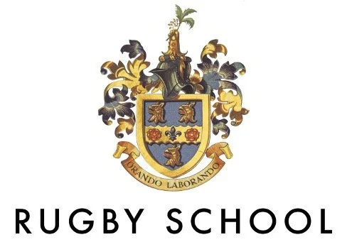
RUGBY SCHOOL LOGO
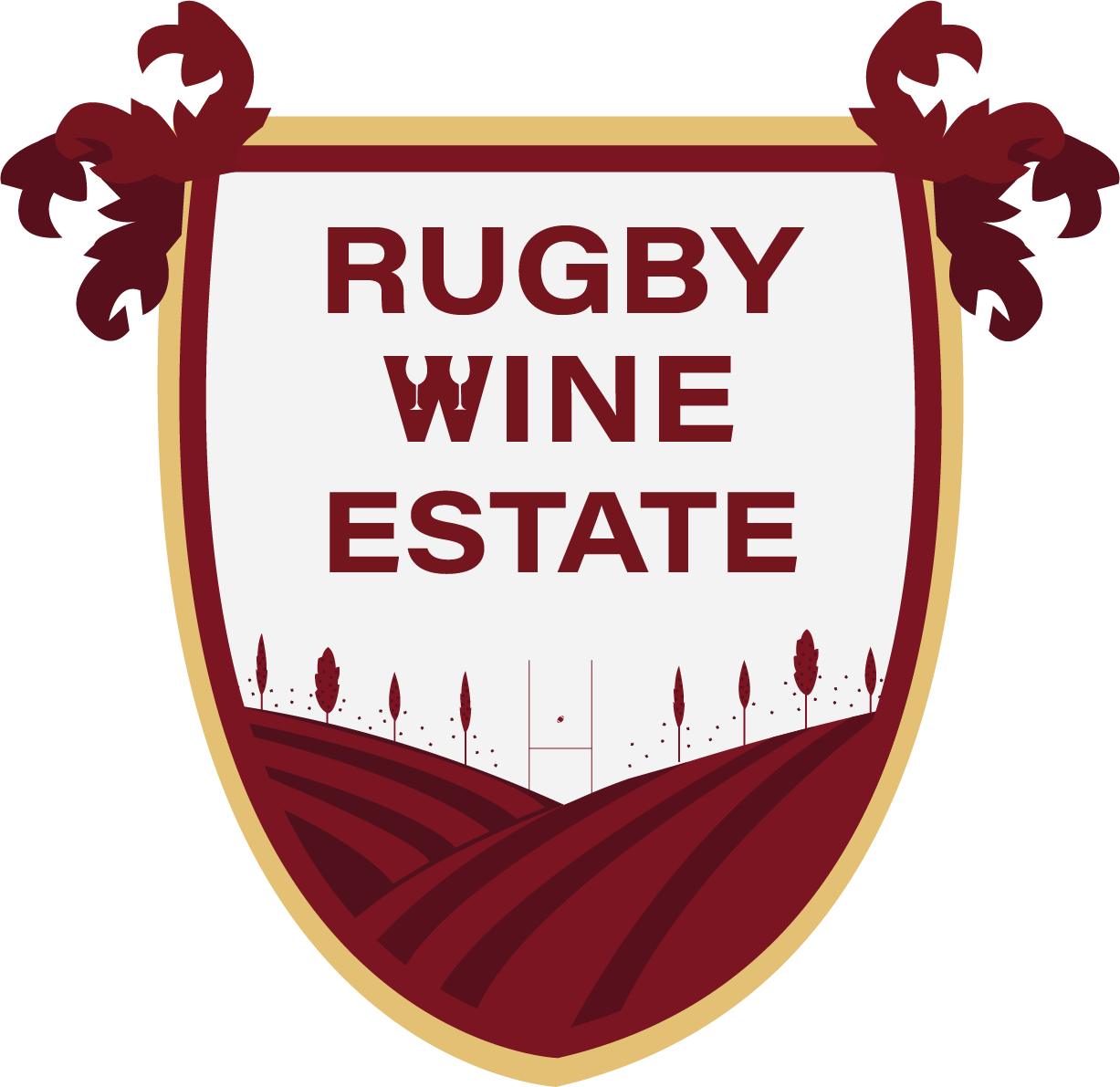
This was an important aspect to look into as part of the project as I wanted to see if I could be inspired to include the traditional aspects of this logo within the wine brand. The use of the floral curls around the crest are what got my attention and this logo needed to have some kind of link to Rugby School’s logo as the CEO did mention this in the briefing.
Design Process
Final Logo Designs
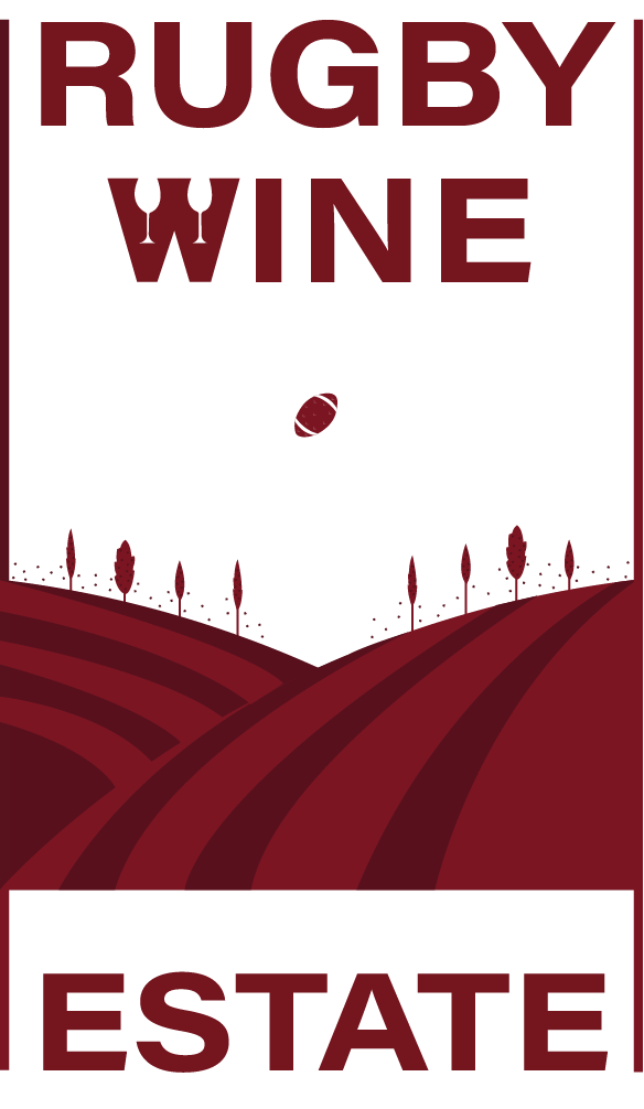
These were the final logo designs I had presented to my CEO, you can see they all have the same brand consistency but with different approaches, the wine glass one is the direct wine element approach, the crest one is a traditional approach using inspiration from Rugby School and the Rugby post one is the very modern approach with only a slight nod to the wine element with the use of the vineyard illustration I designed as well as the tiny Rugby ball in the distance.
Overall I am very pleased with how these turned out. I do think there is room for improvement but for now the CEO did say that this came second place in the competition. That for me is a huge accomplishment as my idea, logo designs and me as a creative got that recognition. My skills were able to be shown as well as my capabilities.

